
One of the new features of Next.js 10 I really like is the image component. It simplifies how we load responsive, optimized images in our site.
How to create responsive Images
It is important to have different sizes of images for your website. If users are viewing your website on a mobile device, will you show them an image that is 1000px wide? Or if they are on a desktop device, will you show them a 200px wide image?
You need to load the appropriate image depending on the screen size and resolutions.
To make images responsive using the img tag, you would usually do something like this.
<img src="small.jpg" srcset="medium.jpg 1000w, large.jpg 2000w" alt="my-image" />
The srcset attribute figures out which of the images is best for the browser resolution, but you need to have different image sizes.
When you use Next.js image component, images are resized and optimized on the fly. Images are responsive by default. No need to have different images for different sizes and resolutions.
Images are also served in webp format (if the browser supports it) — modern image format that supports superior lossless compression of images.
How to use it
You need to have Next.js 10 to be able to use the image component.
import Image from 'next/image';

export const Profile = () => (
  <Image src="/assets/profile-pic.jpg" alt="my picture" width={1200} height={900} />
);

export default Profile;
The src, width, and height props are required. If you don't pass the width and height props, you will have to set the layout prop to fill.
<Image src="/assets/profile-pic.jpg" alt="my picture" width={1200} height={900} layout="fill" />
There are 4 possible layouts with the image component.
fixed— no responsiveness with the image.intrinsic(the default) — The image will scale the dimensions down for smaller viewports but maintain the original dimensions for larger viewports.responsive— The image will scale the dimensions down for smaller viewports and scale up for larger viewports.fill— The image will stretch both width and height to the dimensions of the parent element.
For a full list of props that the component accepts, you can check the docs.
Faster websites with images
The image component was built with optimization of images in mind.
Not so long ago, I have worked with a website of a friend that loaded multiple images in the homepage. When I opened the page for the first time, I was surprised that it took so long to open the home page (a very simple page). The most annoying part was that when I opened it on my phone, my phone would sometimes freeze.
When I checked the network tab, I saw that the main culprit was the images.
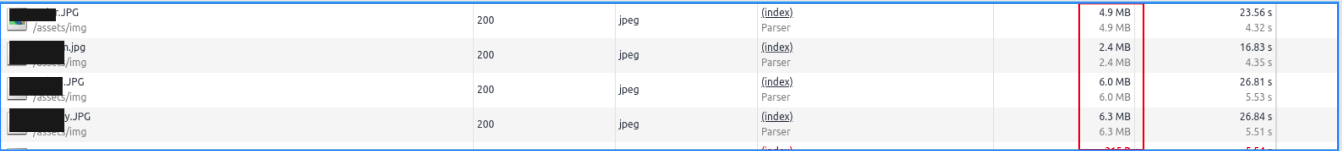
That's a whole lof of unoptimized images 😲. The files are huge and they are loaded even if they are not yet in the viewport.
After refactoring the code to use the image component of Next.js, the load time of the page has considerably improved. The images are now only loaded when it reaches the viewport and the format is in webp. The sizes are also small compared to the original size (a huge difference).

Next.js image component lazy loads images by default.
How to style the image component
In order to style the image component, you have to wrap it with an outer div and apply the styles on the outer div.
<div className="image-wrapper">
  <Image src="/assets/profile-pic.jpg" alt="my picture" width={1200} height={900} layout="fill" />
</div>
Conclusion
My experience working with the image component is amazing so far. I really like this new feature because it simplifies my work as a developer to create responsive, optimized images. Images are part of any app or website, and if they are not optimized, they could destroy the whole user experience.
By using the image component, you could easily create an image that is responsive and optimized without doing a lot of work. So, use it in your Next project 😉.
- Authors

- Name
- Naina Razafindrabiby
- @nr_razz